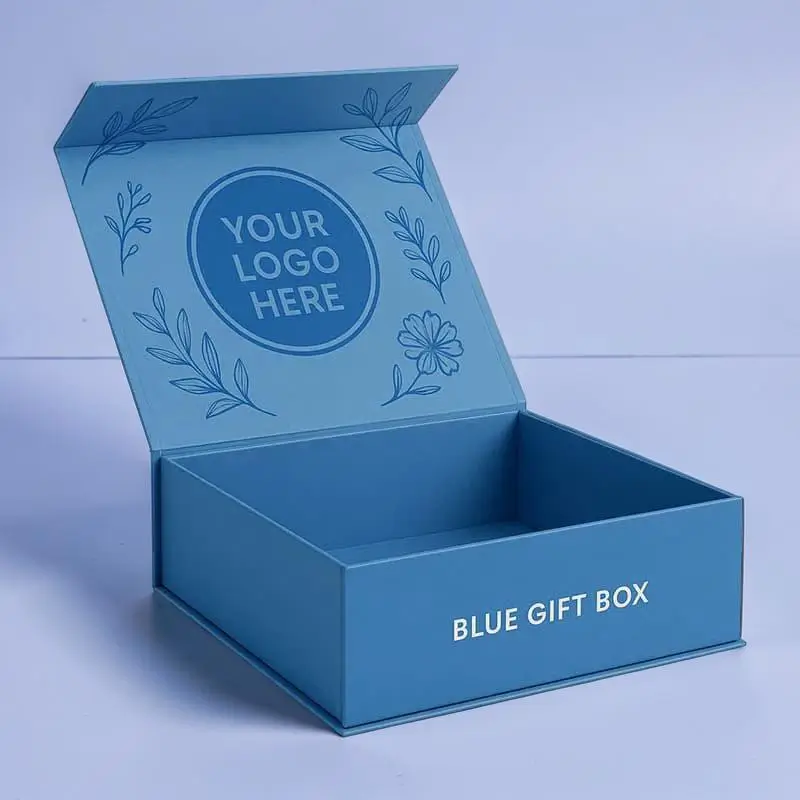
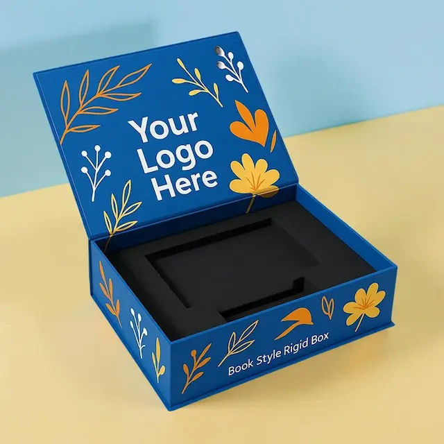
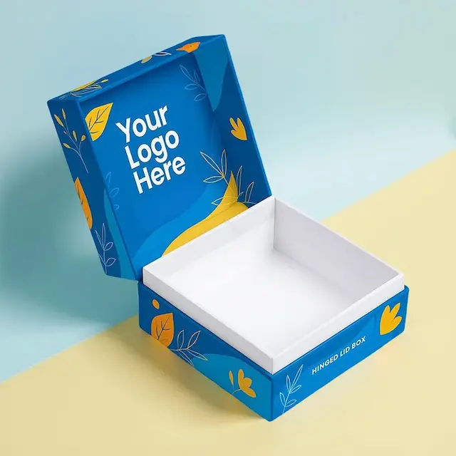
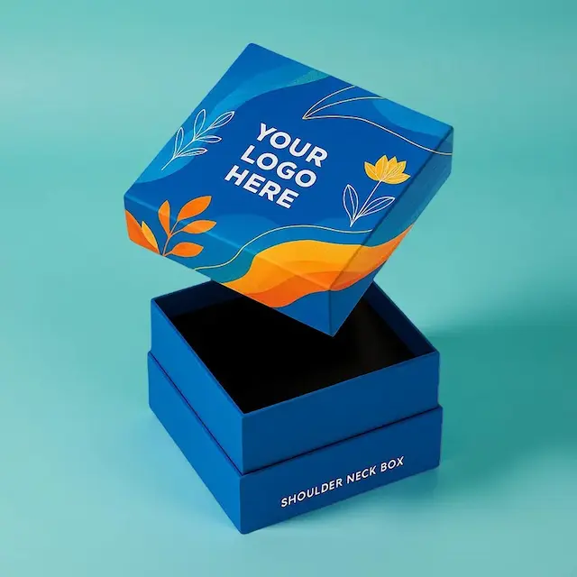
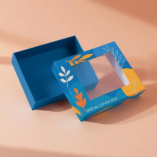
Custom Blue Gift Boxes & Blue Gift Packaging
Blue is one of the few colours that works across almost every occasion. Corporate, baby showers, weddings, Hanukkah, winter seasonal ranges. It reads calm and trustworthy rather than loud, which is why so many brands default to it. It is also one of the harder colours to reproduce accurately on press. We produce a lot of blue gift packaging at ZEE Packaging and matching a specific blue is where most of the attention goes.
Blue Is Hard To Match Exactly
A blue gift box needs proper colour management.
- Vivid blues sit outside what CMYK can reliably achieve
- A Pantone spot colour gives you an exact, repeatable result
- Navy and deep blue print far more consistently than bright cyan
- The same blue shifts noticeably between coated and uncoated board
- Kraft turns any blue warmer and duller
- Screen approval is where most disappointment starts
Most complaints about blue gift packaging come from approving a shade on a monitor rather than on a printed proof.
Which Blue For Which Occasion
The shade changes the message considerably.
- Navy reads formal and corporate
- Royal blue feels celebratory and confident
- Powder blue suits baby and christening ranges
- Teal and petrol read modern and design led
- Ice blue works for winter and seasonal collections
- Deep midnight blue behaves almost like black for luxury
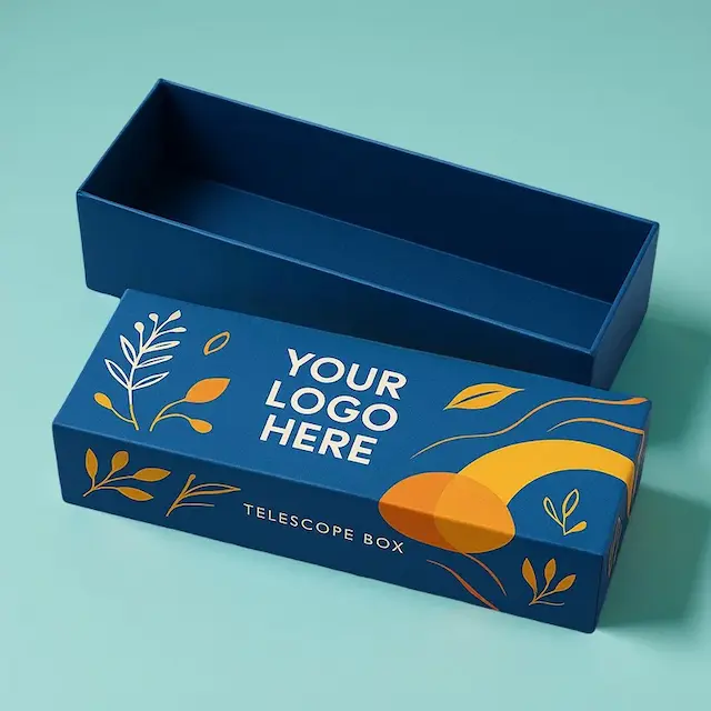
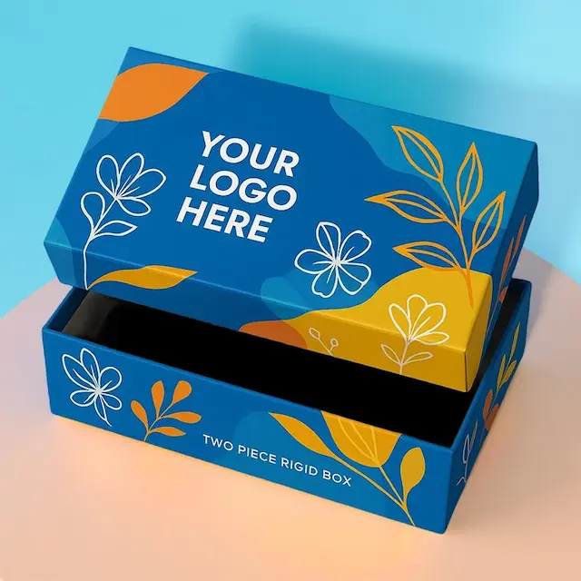
- Rigid lid and base the classic blue gift box
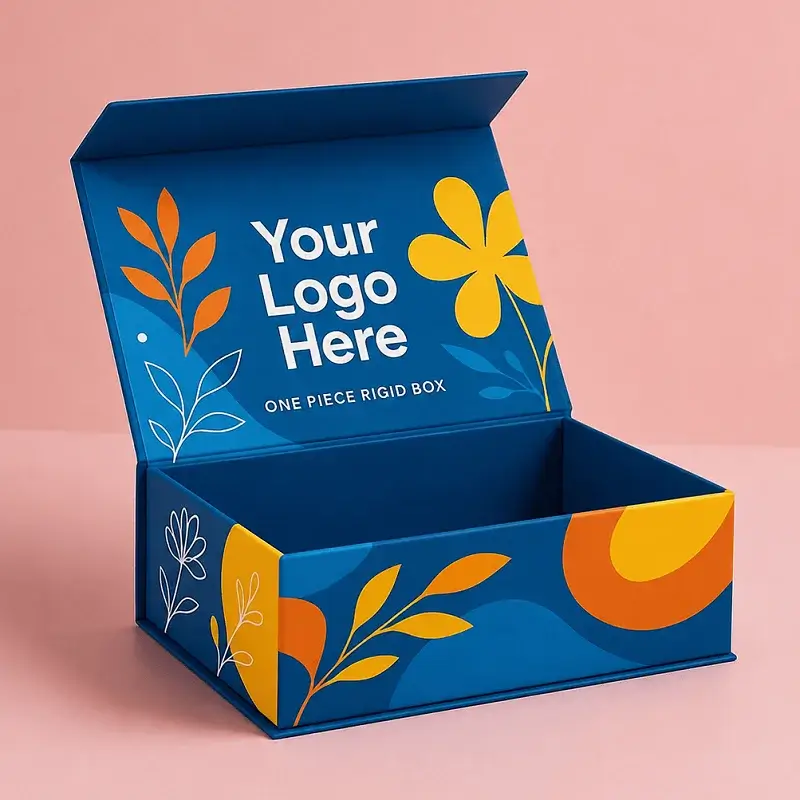
- Magnetic closure box premium blue gift packaging
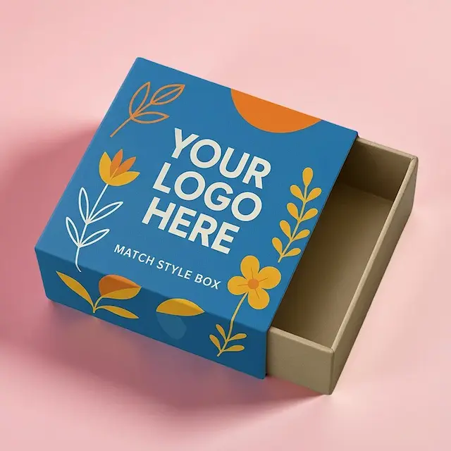
- Drawer slide box a slow reveal for gifting
- Sleeve over a tray the rigid look at a lower cost
- Folding carton everyday retail formats
- Hamper box with a lid larger multi item sets
Sizes We Print Regular
Every blue gift box is built to your product, though these run often:
- 6" x 4" x 2" for a small gift
- 8" x 6" x 3" for a mid size item
- 10" x 8" x 3" for a curated set
- 9" x 9" x 3" for a square format
- 4" x 4" x 4" for a candle or jar
- 14" x 10" x 4" for a hamper
Board And Finish
- Rigid greyboard 36pt or 48pt with a litho printed wrap
- SBS C1S for the truest, most vivid blue reproduction
- Pantone spot colour where the shade must match a brand palette
- Matte lamination, which deepens navy particularly well
- Silver and gold foil, both of which sit beautifully against blue
- Corrugated E flute for the shipping outer
Large flat areas of blue show every inconsistency, so we watch ink density closely on solid panels rather than assuming it will run evenly.
Kinder Material Choices
- Recycled greyboard core under a printed wrap
- FSC certified stock, certificate available on request
- Soy based ink through the whole run
- Aqueous coating rather than plastic lamination
- Paperboard or moulded pulp inserts instead of foam
- A blue gift box people keep and reuse
How An Order Runs With Us
- 100 unit minimum, so a small brand can order properly
- Free 3D mockup and flat proof before anything prints
- Free dieline drawn by our own designer
- Physical proof on request, which we strongly recommend for blue
- Urgent turnaround at 5 to 8 business days
- Free shipping worldwide with nothing hidden
Frequently Asked Questions
Why does my blue look different to the screen?
Screens emit light and board reflects it. Vivid blues in particular sit outside CMYK range, which is why we proof physically.
CMYK or Pantone?
Pantone where the blue is a brand colour that must match everything else. CMYK where a small variance between runs is acceptable.
Will it match across reorders?
With a spot colour, closely. We keep your approved proof and ink sequence on file so repeat runs stay consistent.
How much is a blue gift box?
Rough estimate is $0.35 to $0.95 per unit for a folding carton, $1.80 to $4.20 for rigid with a wrap and $2.60 to $6.00 for magnetic closure at moderate quantity. Spot colour and finishing move it. Shipping is included in our price. This is estimate only, so ask our team for a exact quote.
Which foil works best?
Silver for a cool modern look, gold for warmth and contrast. Both read considerably richer on blue than on a pale board.
Can you print blue on kraft?
You can, but it goes warm and muted. For a true blue we would move you to white SBS.
Does matte or gloss suit navy better?
Matte, generally. It deepens the shade and hides handling marks, which show up on gloss dark board.