

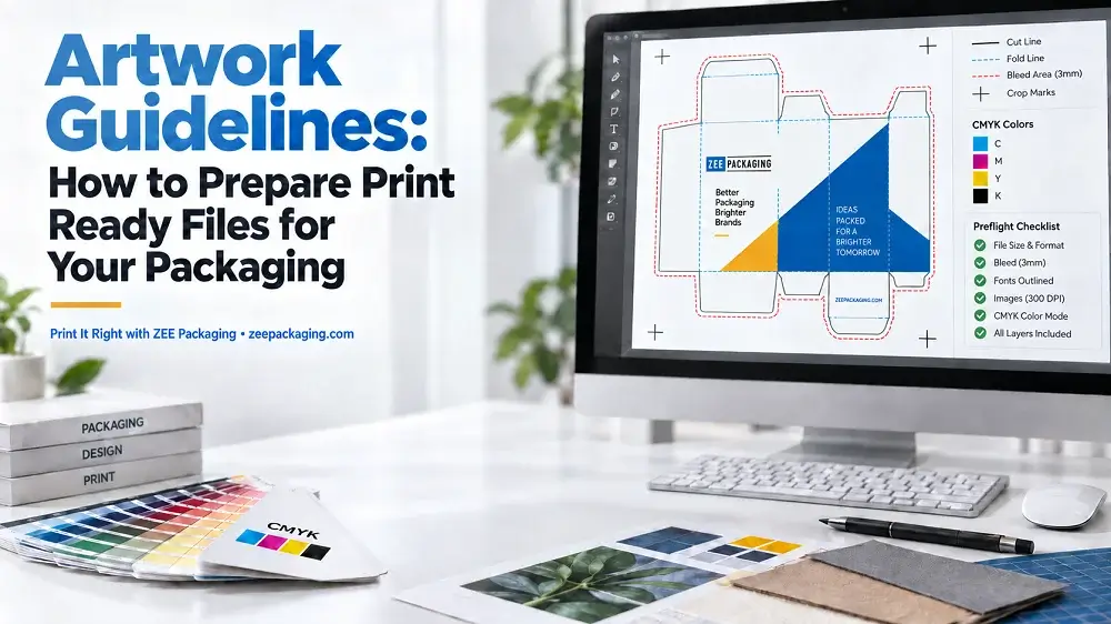
Artwork Guidelines: How to Prepare Print Ready Files for Your Packaging
Getting your packaging artwork right before it goes to press saves you time, money and a lot of back and forth with your printer. We see the same handful of issues come up again and again at ZEE Packaging, and almost all of them are avoidable with a few basic checks. So here is a plain explanation of what your printer actually needs from you.
Why File Setup Matters So Much
Offset printing is not like printing at home. Your file gets separated into individual color plates, mounted on press, and once the makeready is done and the press is running, there is no undo button. A 2mm mistake in your packaging artwork becomes 5,000 misprinted boxes. That is why prepress teams are picky.
Start With the Dieline
Before you design anything, get the dieline. A dieline is the flat blueprint of your box showing cut lines, fold lines, glue flaps and safe zones.
- Cut lines mark where the die cuts the board
- Fold lines show where creases go, usually dotted
- Glue flaps need to stay free of heavy ink coverage
- Safe zone is where your critical content lives
Always design on top of the dieline layer, never beside it. Keep the dieline on its own separate layer, named clearly, and set to overprint so it does not knock out your packaging artwork underneath.
File Formats We Accept
- AI (Adobe Illustrator) is our first choice
- PDF saved as PDF/X-1a or PDF/X-4
- EPS for vector work
- PSD for raster heavy designs
Vector is always better for logos, text and line work because it stays sharp at any size. Raster images are fine for photography but they need enough resolution.
Color: CMYK, Pantone and Why It Matters
Design in CMYK, not RGB. Screens use RGB and it looks brighter than anything a press can reproduce. If you build your packaging artwork in RGB and send it over, the conversion happens anyway and your bright blue turns muddy.
For exact brand colors, specify a Pantone (PMS) spot color. Spot colors get their own plate and their own ink, mixed to match. This matters for logos where color consistency across print runs is part of the brand.
A few color points worth knowing:
- Total ink coverage should stay under 300% to avoid setoff and slow drying
- Rich black for large areas: 60C 40M 40Y 100K, not plain 100K
- Small text should print 100K only, never four color, to avoid registration issues
- Trapping compensates for slight plate misalignment on press
Resolution and Image Quality
All raster images in your packaging artwork need to be 300 DPI at final printed size. An image that is 300 DPI at 2 inches becomes 75 DPI when you scale it to 8 inches. Check the effective resolution, not the original file resolution.
Bleed, Trim and Safe Margins
- Bleed: extend artwork 1/8 inch past every trim edge
- Trim: the actual cut line
- Safety margin: keep text and logos 1/8 inch inside the trim
Cutting is mechanical and there is always small variance. Bleed covers that variance so you never get a white sliver along the edge.
Fonts
Outline all fonts before sending, or embed them in the PDF. If fonts are neither outlined nor embedded, the file opens with substitutions and your layout shifts. Once fonts are outlined they become vector shapes and cannot be edited, so keep an editable master copy for yourself.
Finishing Layers
If you want spot UV, foil stamping, embossing or window patching, these need separate layers in your packaging artwork:
- Name each layer clearly (Spot UV, Foil, Emboss)
- Build them in 100% of a single spot color
- Set them to overprint
- Keep foil and emboss elements simple, fine detail does not hold well
Barcodes and Compliance Content
Barcodes should be vector, printed in solid black on white, at minimum 80% magnification with quiet zones intact. Never place a barcode across a fold or on a curved panel. If your product needs nutritional panels, warning text or regulatory marks, confirm minimum type sizes for your category before you finalize.
What Happens After You Send Files
At ZEE Packaging our prepress team reviews everything against the dieline, checks color mode, resolution, bleed, font handling and finishing layers. If something needs fixing we flag it and come back to you. Once everything checks out we produce a digital proof showing a 3D mockup and a flat view. Nothing goes to plate until you approve that proof.
People Asked Questions
What is the difference between spot color and process color?
Process color builds every shade from four inks (CMYK) layered as halftone dots. Spot color is a premixed ink applied from its own plate. Process is cheaper for full color imagery, spot gives exact matching for brand colors and flat solids.
Why does my printed box look different from my monitor?
Monitors emit light and have a much wider gamut than ink on paper. Board also absorbs ink differently depending on coating and stock. A coated SBS reproduces color far more vividly than uncoated kraft using the exact same file.
What does overprint mean and when do I use it?
Overprint tells the press to lay one ink directly on top of another instead of knocking out the area underneath. It is standard for dielines, finishing layers and small black text. Used wrongly it makes elements disappear from the final print.
Do I need to include bleed if my design has a white background?
Yes. Trim variance still applies and without bleed you risk an inconsistent edge. It costs nothing to add and removes a common source of rejected files.
What is a proof and what should I check on it?
A proof shows how your file will output. Check spelling, dimensions, panel orientation, color breaks, barcode placement and whether finishing layers sit where you intended. Approval means production begins exactly as shown.